


Description
Bullseye
Highlights
Relative Strength Environments
Market environments can be influenced by microeconomic and macroeconomic factors. Microeconomic factors are based
on the merits of the individual companies or industries, whereas macroeconomic factors reflect the overall economy or
other news-driven events. There is no guarantee that an investment strategy will perform well in any market environment,
but generally speaking, trend following strategies such as relative strength tend to perform better in environments where
microeconomic factors are more dominant. When there are large outside influences wreaking havoc on the markets, it is hard
to identify market leadership.
As the saying goes, a rising tide lifts all boats. Likewise, a hurricane can sink all boats. Good or bad, outside macroeconomic factors can play a significant role on the market environment. One way to measure the market environment is by looking at the correlation of investments.
Correlation is a statistic that measures price movements of securities to determine if they are moving in unison. A correlation of 1.00 shows perfect correlation and 0.00 indicates no relationship in behavior. Historically, stock correlations fall somewhere in between when compared to one another.
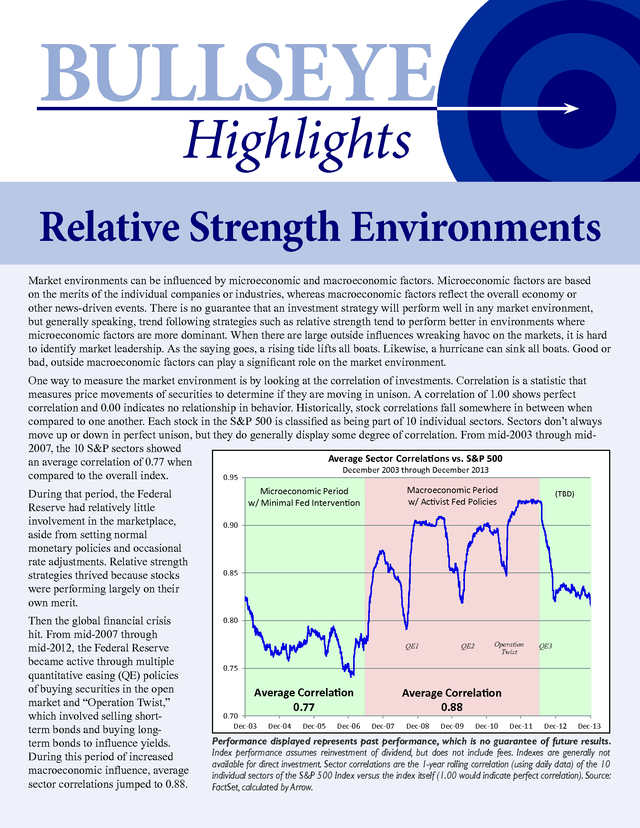
Each stock in the S&P 500 is classified as being part of 10 individual sectors. Sectors don’t always move up or down in perfect unison, but they do generally display some degree of correlation. From mid-2003 through mid2007, the 10 S&P sectors showed Average Sector Correlations vs.
S&P 500 an average correlation of 0.77 when December 2003 through December 2013 compared to the overall index. 0.95 During that period, the Federal Reserve had relatively little involvement in the marketplace, aside from setting normal monetary policies and occasional rate adjustments. Relative strength strategies thrived because stocks were performing largely on their own merit. Then the global financial crisis hit. From mid-2007 through mid-2012, the Federal Reserve became active through multiple quantitative easing (QE) policies of buying securities in the open market and “Operation Twist,” which involved selling shortterm bonds and buying longterm bonds to influence yields. During this period of increased macroeconomic influence, average sector correlations jumped to 0.88. Macroeconomic Period w/ Activist Fed Policies Microeconomic Period w/ Minimal Fed Intervention (TBD) 0.90 0.85 0.80 QE1 QE2 Operation Twist QE3 0.75 Average Correlation 0.77 0.70 Dec-03 Dec-04 Dec-05 Dec-06 Average Correlation 0.88 Dec-07 Dec-08 Dec-09 Dec-10 Dec-11 Dec-12 Dec-13 Performance displayed represents past performance, which is no guarantee of future results. Index performance assumes reinvestment of dividend, but does not include fees.
Indexes are generally not available for direct investment. Sector correlations are the 1-year rolling correlation (using daily data) of the 10 individual sectors of the S&P 500 Index versus the index itself (1.00 would indicate perfect correlation). Source: FactSet, calculated by Arrow. .
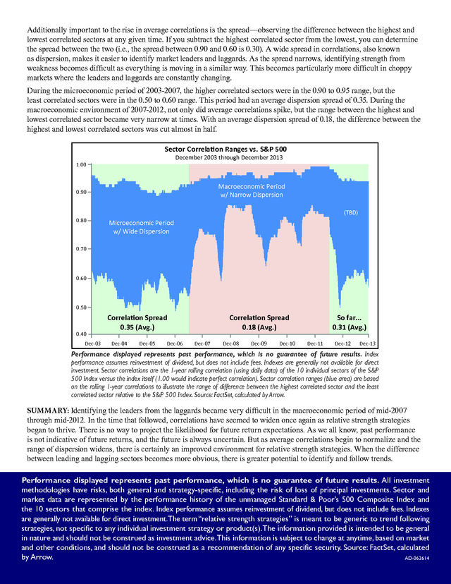
Additionally important to the rise in average correlations is the spread—observing the difference between the highest and lowest correlated sectors at any given time. If you subtract the highest correlated sector from the lowest, you can determine the spread between the two (i.e., the spread between 0.90 and 0.60 is 0.30). A wide spread in correlations, also known as dispersion, makes it easier to identify market leaders and laggards. As the spread narrows, identifying strength from weakness becomes difficult as everything is moving in a similar way.
This becomes particularly more difficult in choppy markets where the leaders and laggards are constantly changing. During the microeconomic period of 2003-2007, the higher correlated sectors were in the 0.90 to 0.95 range, but the least correlated sectors were in the 0.50 to 0.60 range. This period had an average dispersion spread of 0.35. During the macroeconomic environment of 2007-2012, not only did average correlations spike, but the range between the highest and lowest correlated sector became very narrow at times.
With an average dispersion spread of 0.18, the difference between the highest and lowest correlated sectors was cut almost in half. Sector Correlation Ranges vs. S&P 500 December 2003 through December 2013 1.00 Macroeconomic Period w/ Narrow Dispersion 0.90 (TBD) 0.80 Microeconomic Period w/ Wide Dispersion 0.70 0.60 0.50 0.40 Dec-03 Correlation Spread 0.35 (Avg.) Dec-04 Dec-05 Dec-06 Correlation Spread 0.18 (Avg.) Dec-07 Dec-08 Dec-09 Dec-10 So far... 0.31 (Avg.) Dec-11 Dec-12 Dec-13 Performance displayed represents past performance, which is no guarantee of future results. Index performance assumes reinvestment of dividend, but does not include fees.
Indexes are generally not available for direct investment. Sector correlations are the 1-year rolling correlation (using daily data) of the 10 individual sectors of the S&P 500 Index versus the index itself (1.00 would indicate perfect correlation). Sector correlation ranges (blue area) are based on the rolling 1-year correlations to illustrate the range of difference between the highest correlated sector and the least correlated sector relative to the S&P 500 Index.
Source: FactSet, calculated by Arrow. SUMMARY: Identifying the leaders from the laggards became very difficult in the macroeconomic period of mid-2007 through mid-2012. In the time that followed, correlations have seemed to widen once again as relative strength strategies began to thrive. There is no way to project the likelihood for future return expectations.
As we all know, past performance is not indicative of future returns, and the future is always uncertain. But as average correlations begin to normalize and the range of dispersion widens, there is certainly an improved environment for relative strength strategies. When the difference between leading and lagging sectors becomes more obvious, there is greater potential to identify and follow trends. Performance displayed represents past performance, which is no guarantee of future results.
All investment methodologies have risks, both general and strategy-specific, including the risk of loss of principal investments. Sector and market data are represented by the performance history of the unmanaged Standard & Poor’s 500 Composite Index and the 10 sectors that comprise the index. Index performance assumes reinvestment of dividend, but does not include fees.
Indexes are generally not available for direct investment. The term “relative strength strategies” is meant to be generic to trend following strategies, not specific to any individual investment strategy or product(s). The information provided is intended to be general in nature and should not be construed as investment advice.This information is subject to change at anytime, based on market and other conditions, and should not be construed as a recommendation of any specific security.
Source: FactSet, calculated by Arrow. AD-062614 .
As the saying goes, a rising tide lifts all boats. Likewise, a hurricane can sink all boats. Good or bad, outside macroeconomic factors can play a significant role on the market environment. One way to measure the market environment is by looking at the correlation of investments.
Correlation is a statistic that measures price movements of securities to determine if they are moving in unison. A correlation of 1.00 shows perfect correlation and 0.00 indicates no relationship in behavior. Historically, stock correlations fall somewhere in between when compared to one another.
Each stock in the S&P 500 is classified as being part of 10 individual sectors. Sectors don’t always move up or down in perfect unison, but they do generally display some degree of correlation. From mid-2003 through mid2007, the 10 S&P sectors showed Average Sector Correlations vs.
S&P 500 an average correlation of 0.77 when December 2003 through December 2013 compared to the overall index. 0.95 During that period, the Federal Reserve had relatively little involvement in the marketplace, aside from setting normal monetary policies and occasional rate adjustments. Relative strength strategies thrived because stocks were performing largely on their own merit. Then the global financial crisis hit. From mid-2007 through mid-2012, the Federal Reserve became active through multiple quantitative easing (QE) policies of buying securities in the open market and “Operation Twist,” which involved selling shortterm bonds and buying longterm bonds to influence yields. During this period of increased macroeconomic influence, average sector correlations jumped to 0.88. Macroeconomic Period w/ Activist Fed Policies Microeconomic Period w/ Minimal Fed Intervention (TBD) 0.90 0.85 0.80 QE1 QE2 Operation Twist QE3 0.75 Average Correlation 0.77 0.70 Dec-03 Dec-04 Dec-05 Dec-06 Average Correlation 0.88 Dec-07 Dec-08 Dec-09 Dec-10 Dec-11 Dec-12 Dec-13 Performance displayed represents past performance, which is no guarantee of future results. Index performance assumes reinvestment of dividend, but does not include fees.
Indexes are generally not available for direct investment. Sector correlations are the 1-year rolling correlation (using daily data) of the 10 individual sectors of the S&P 500 Index versus the index itself (1.00 would indicate perfect correlation). Source: FactSet, calculated by Arrow. .
Additionally important to the rise in average correlations is the spread—observing the difference between the highest and lowest correlated sectors at any given time. If you subtract the highest correlated sector from the lowest, you can determine the spread between the two (i.e., the spread between 0.90 and 0.60 is 0.30). A wide spread in correlations, also known as dispersion, makes it easier to identify market leaders and laggards. As the spread narrows, identifying strength from weakness becomes difficult as everything is moving in a similar way.
This becomes particularly more difficult in choppy markets where the leaders and laggards are constantly changing. During the microeconomic period of 2003-2007, the higher correlated sectors were in the 0.90 to 0.95 range, but the least correlated sectors were in the 0.50 to 0.60 range. This period had an average dispersion spread of 0.35. During the macroeconomic environment of 2007-2012, not only did average correlations spike, but the range between the highest and lowest correlated sector became very narrow at times.
With an average dispersion spread of 0.18, the difference between the highest and lowest correlated sectors was cut almost in half. Sector Correlation Ranges vs. S&P 500 December 2003 through December 2013 1.00 Macroeconomic Period w/ Narrow Dispersion 0.90 (TBD) 0.80 Microeconomic Period w/ Wide Dispersion 0.70 0.60 0.50 0.40 Dec-03 Correlation Spread 0.35 (Avg.) Dec-04 Dec-05 Dec-06 Correlation Spread 0.18 (Avg.) Dec-07 Dec-08 Dec-09 Dec-10 So far... 0.31 (Avg.) Dec-11 Dec-12 Dec-13 Performance displayed represents past performance, which is no guarantee of future results. Index performance assumes reinvestment of dividend, but does not include fees.
Indexes are generally not available for direct investment. Sector correlations are the 1-year rolling correlation (using daily data) of the 10 individual sectors of the S&P 500 Index versus the index itself (1.00 would indicate perfect correlation). Sector correlation ranges (blue area) are based on the rolling 1-year correlations to illustrate the range of difference between the highest correlated sector and the least correlated sector relative to the S&P 500 Index.
Source: FactSet, calculated by Arrow. SUMMARY: Identifying the leaders from the laggards became very difficult in the macroeconomic period of mid-2007 through mid-2012. In the time that followed, correlations have seemed to widen once again as relative strength strategies began to thrive. There is no way to project the likelihood for future return expectations.
As we all know, past performance is not indicative of future returns, and the future is always uncertain. But as average correlations begin to normalize and the range of dispersion widens, there is certainly an improved environment for relative strength strategies. When the difference between leading and lagging sectors becomes more obvious, there is greater potential to identify and follow trends. Performance displayed represents past performance, which is no guarantee of future results.
All investment methodologies have risks, both general and strategy-specific, including the risk of loss of principal investments. Sector and market data are represented by the performance history of the unmanaged Standard & Poor’s 500 Composite Index and the 10 sectors that comprise the index. Index performance assumes reinvestment of dividend, but does not include fees.
Indexes are generally not available for direct investment. The term “relative strength strategies” is meant to be generic to trend following strategies, not specific to any individual investment strategy or product(s). The information provided is intended to be general in nature and should not be construed as investment advice.This information is subject to change at anytime, based on market and other conditions, and should not be construed as a recommendation of any specific security.
Source: FactSet, calculated by Arrow. AD-062614 .


